
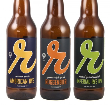
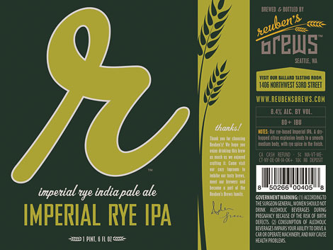
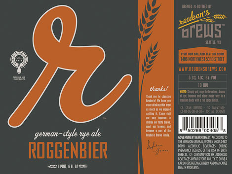
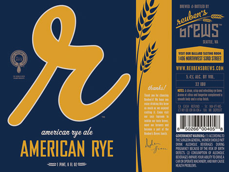
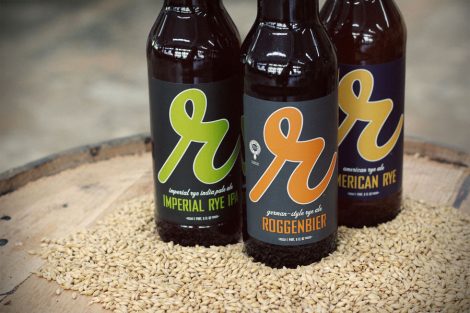
is a popular new urban brewery located in the Ballard neighborhood of Seattle, which is quickly becoming a brewing hotspot. Taphandles worked with their existing brand to create 22oz bottle labels for their inaugural bottling. The bold “r” monogram logo in a modern pallet pops on the shelf while the back of the label serves as an advertisement to entice beer lovers into visiting the brewery’s tasting room where they will find a dozen creative brews on tap. Taphandles is currently designing custom tap handles for Reuben’s Brews, as well as labels for future releases.
— Taphandles
Fonts used: , , ,

Matt
May 10, 2013 at 4:25 pm
Siiiiiiick!!!
These Taphandles folk seem to have a hella amount of talent with their branding/packaging work. Well done.