June 11, 2013 | Designed by
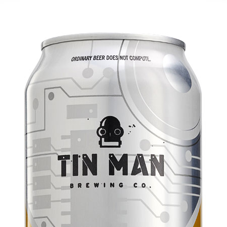
Packaging and identity for Evansville, Indiana’s Tin Man Brewing Company.
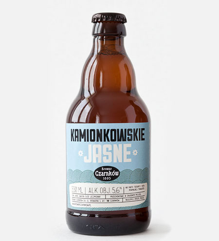
← Kamionkowskie
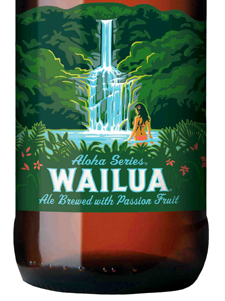
Wailua Ale →
Bob Morphew
June 11, 2013 at 9:25 am
A great company and even better beer!
June 11, 2013 at 10:03 am
Good looking can lineup. Nice consistency with a large enough color change to differentiate between flavors / styles.
Fred
June 11, 2013 at 3:26 pm
I love the circuitry and gear look. Simple yet awesome.
Joe
June 13, 2013 at 11:31 am
“Ordinary Beer Does not Compute.”
Awesome work here.
June 13, 2013 at 10:27 pm
This is real sharp, consistant branding all the way down to the architectural details of the brew pub. The port-hole windows are perfect.
I agree with scott about the cans. The subtle adjustments in the tone on tone backgrounds to go along with the name of the beer is great.
Oh Beautiful Beer celebrates remarkable graphic design from the world of beer.


Bob Morphew
June 11, 2013 at 9:25 am
A great company and even better beer!
June 11, 2013 at 10:03 am
Good looking can lineup. Nice consistency with a large enough color change to differentiate between flavors / styles.
Fred
June 11, 2013 at 3:26 pm
I love the circuitry and gear look. Simple yet awesome.
Joe
June 13, 2013 at 11:31 am
“Ordinary Beer Does not Compute.”
Awesome work here.
June 13, 2013 at 10:27 pm
This is real sharp, consistant branding all the way down to the architectural details of the brew pub. The port-hole windows are perfect.
I agree with scott about the cans. The subtle adjustments in the tone on tone backgrounds to go along with the name of the beer is great.