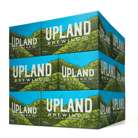
Updating an existing logo, while keeping the basic elements, can be a difficult task, but Young & Laramore pulls it off with this incredible facelift for Bloominton, IN’s
The Old Logo
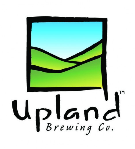
The New Logo

Updating an existing logo, while keeping the basic elements, can be a difficult task, but Young & Laramore pulls it off with this incredible facelift for Bloominton, IN’s
The Old Logo
The New Logo
![]()
![]()
April 9, 2014 at 10:59 am
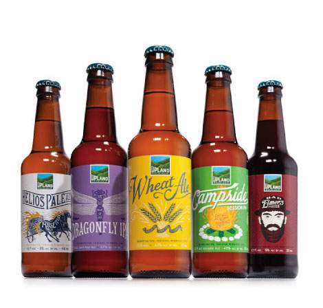
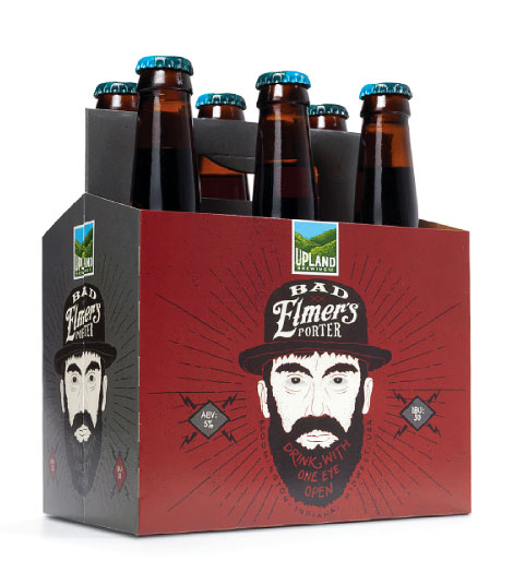
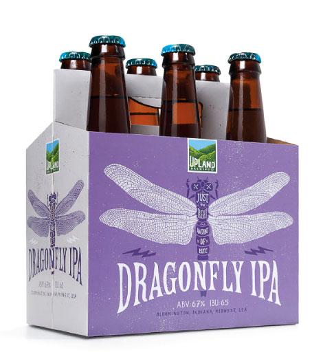
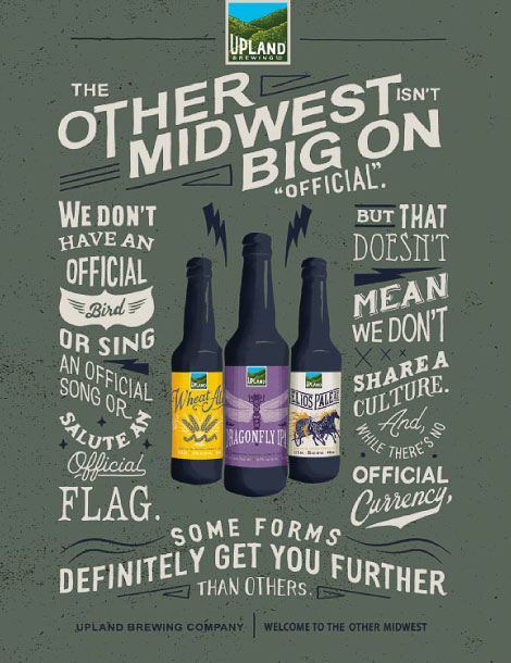
I think I would have picked a different insect for an IPA.
MarkF
April 9, 2014 at 4:12 pm
You’ve never been to Indiana in the summertime, have you..?
April 10, 2014 at 1:56 pm
I have not; do the dragonflies bite there? I guess they bite other insects, but I was thinking of biting people. Just a bug guy’s thought…I do like the artwork.
April 9, 2014 at 11:47 am
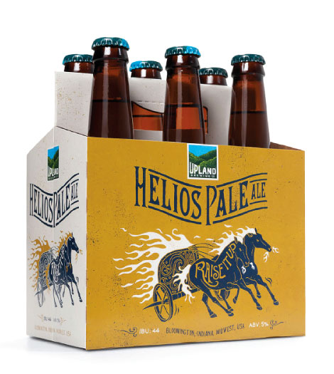
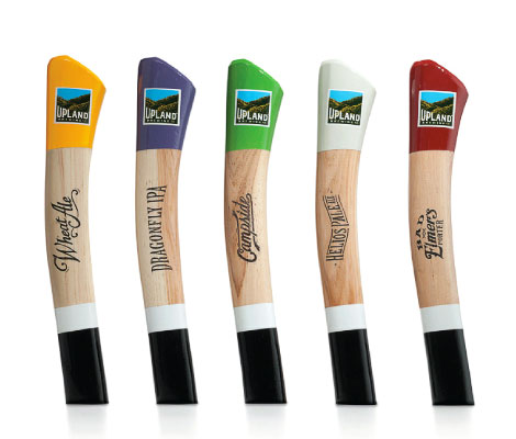
HUGE improvement over the old logo.
Just Some Jerk
April 10, 2014 at 2:05 pm
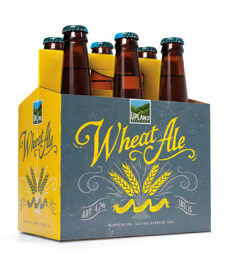
Logo’s great. Everything else? Eh.
April 14, 2014 at 2:39 pm
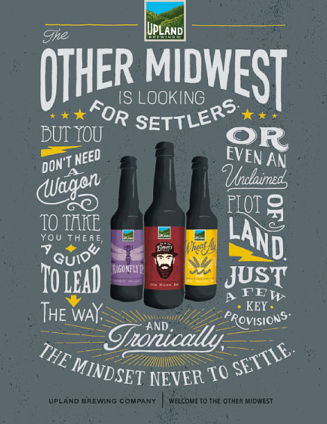
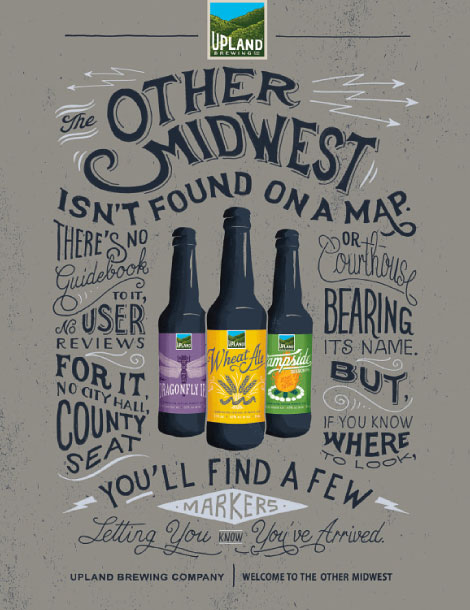
Really digging the update! Wasn’t a huge fan of their old labels.
Federico
April 14, 2014 at 2:44 pm
very good art
Pingback: